Complete Styling & Component Showcase
test
Typography & Text Styling
This page demonstrates all the typography and styling elements used throughout the BEARS website. Everything from headings to body text follows a carefully designed typographic hierarchy.
Heading Hierarchy
All headings use responsive font sizes that scale with screen size. This ensures readability on both mobile and desktop devices.
Subheading Level 4
This is a level 4 heading, often used for subsections within major content blocks.
Heading Level 5
Level 5 headings work for nested topics.
Heading Level 6
Level 6 headings for deeply nested content.
Body Text & Paragraphs
Body text uses a generous line-height (1.75) for comfortable reading. Paragraphs are spaced with consistent margins to create visual rhythm. The font size adapts: 1.0625rem on mobile, scaling up to 1.125rem on desktop.
This paragraph demonstrates bold text, italic text, and bold italic text. You can also use inline code which appears with a subtle background. Links are styled in the accent color and become underlined on hover.
Lists & Indentation
Bullet points and numbered lists maintain consistent indentation and spacing:
- First item with explanation
- Second item demonstrating list flow
- Nested items can go multiple levels deep:
- Sub-item one
- Sub-item two
- Sub-item three
- Fourth item continues the main list
Numbered lists work too:
- First step in a process
- Second step with more details
- Third step completing the workflow
- Sub-step A
- Sub-step B
- Final step
Blockquotes
Blockquotes stand out with a left border in the accent color. They’re perfect for highlighting important quotes, testimonials, or key insights from research.
This is another blockquote demonstrating the styling. Multiple blockquotes maintain consistent formatting throughout the page.
Code Blocks
Inline code like const myVariable = 42; appears with subtle styling. For larger code samples:
// Example JavaScript code block
function demonstrateCode() {
  const greeting = "Hello, BEARS!";
  console.log(greeting);
  return greeting;
}

// Code blocks support syntax highlighting
const result = demonstrateCode();
# Python code example
def fibonacci(n):
if n <= 1:
return n
return fibonacci(n-1) + fibonacci(n-2)
# Calculate and print
for i in range(10):
print(fibonacci(i))Button Components
Buttons come in multiple variants and sizes for different use cases:
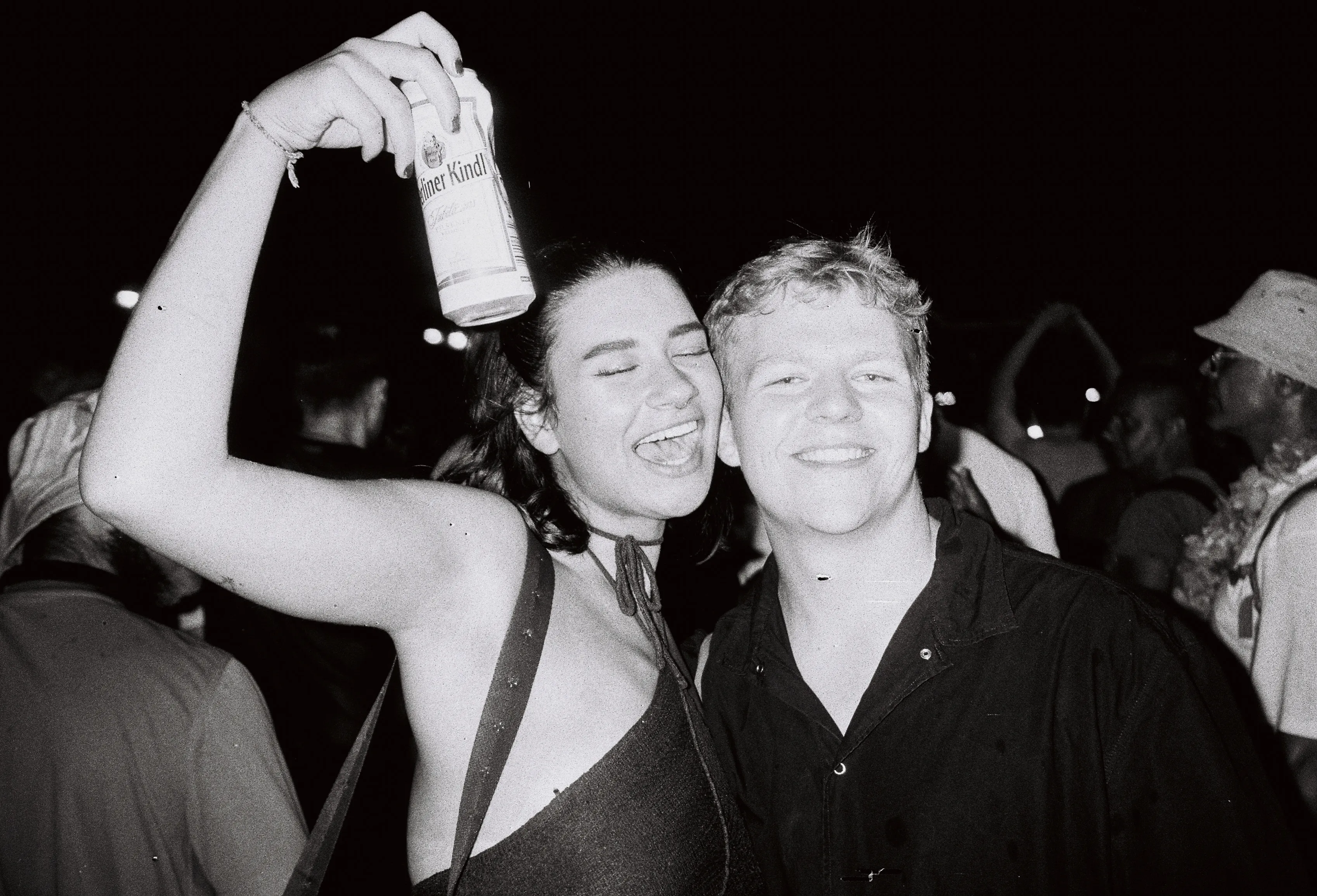
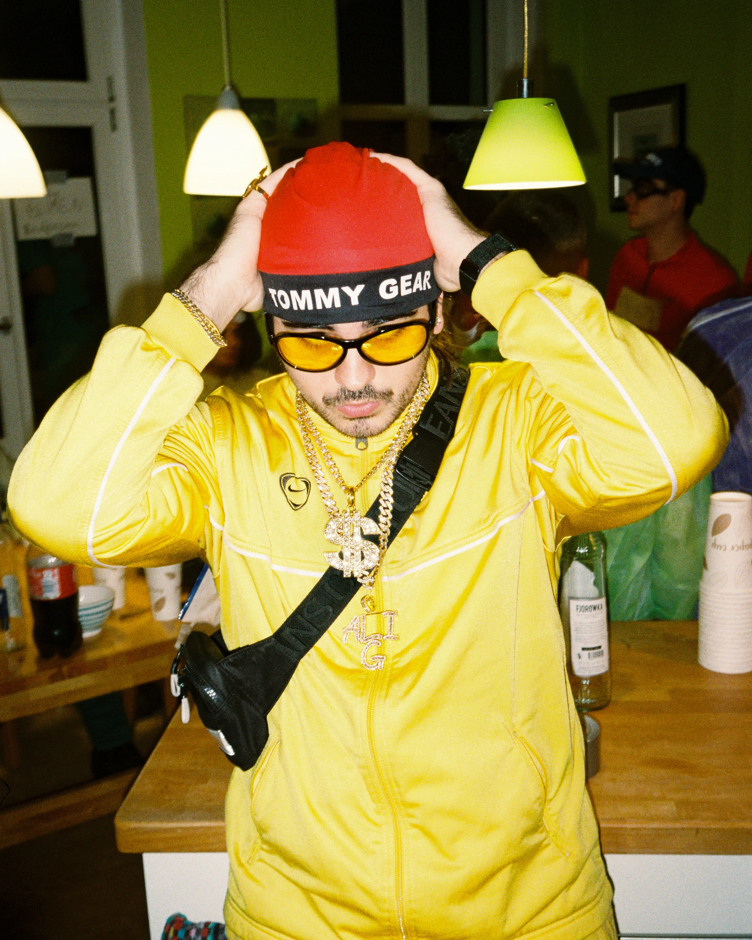
Image Component
The Img component provides optimized, responsive image display with flexible sizing:
Full Width Image
80% Width Image
60% Width Image
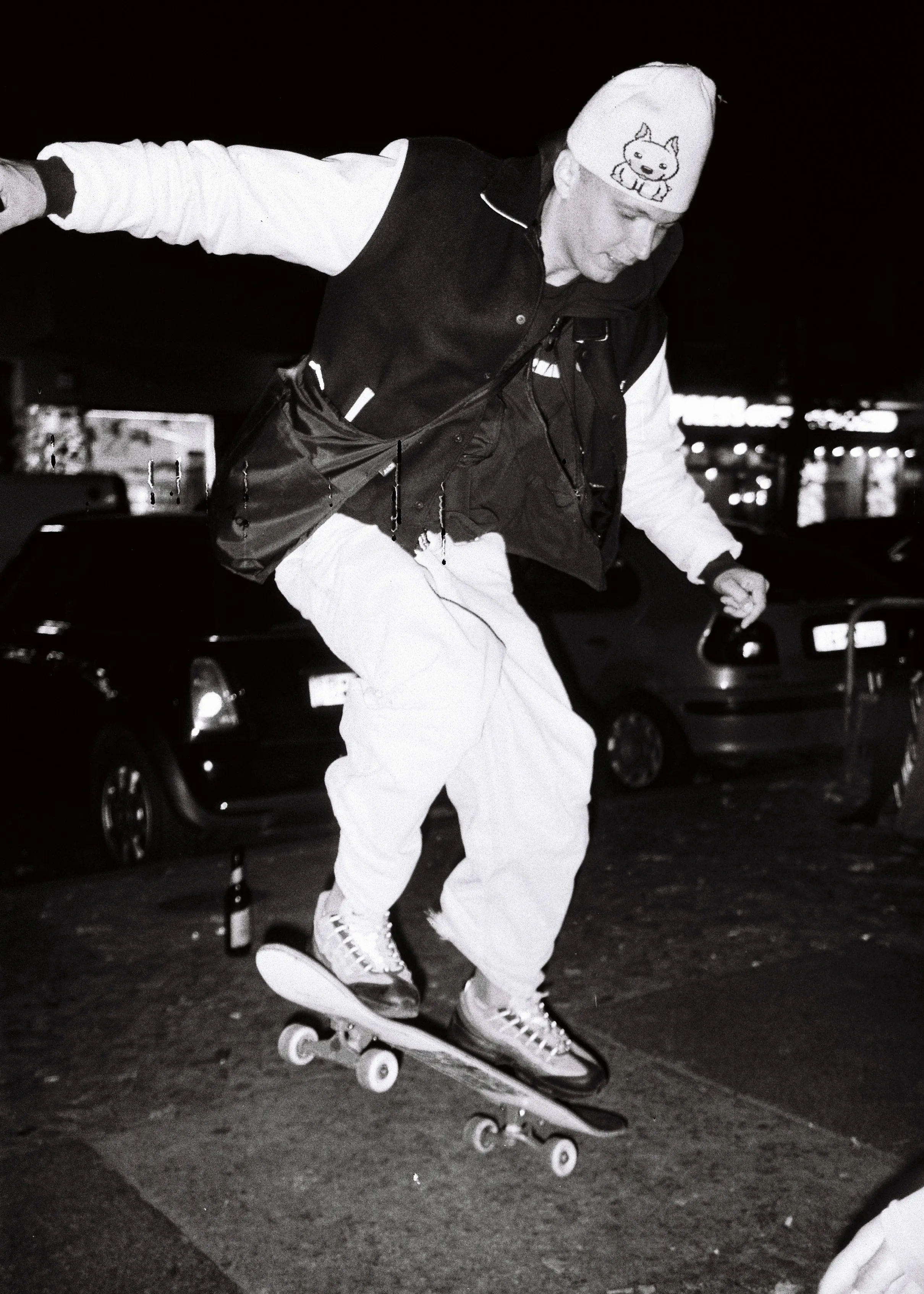
Image Grid
Square
Native
Image Carousel
A carousel can also display images using the Img component:
Accordion Component
Accordions organize content into expandable sections:
General Information
The BEARS program is a comprehensive initiative focused on advancing research and innovation. It brings together students, researchers, and industry partners to tackle real-world challenges through collaborative projects.
- Multi-disciplinary approach
- Industry partnerships
- Student-led research
- Real-world applications
Getting Started
Joining a BEARS project is straightforward:
- Browse available projects on the website
- Check the project requirements and timeline
- Contact the project lead
- Attend the kickoff meeting
- Start collaborating with the team
Each project has different requirements, so check individual project pages for specific details.
Technical Requirements
Required and preferred skills vary by project:
- Always helpful: Problem-solving, teamwork, communication
- Technical: Programming, CAD, data analysis (project-dependent)
- Soft skills: Leadership, project management, documentation
- Nice to have: Previous research experience, domain knowledge
Don't worry if you lack specific skills—the BEARS community is collaborative and supportive.
Project Timeline
Yes, each project has specific milestones and deadlines:
- Project kickoff: Usually at semester start
- Checkpoint reviews: Monthly progress checks
- Final presentation: End of semester
- Documentation deadline: One week before final presentation
Deadlines help keep projects on track and ensure quality deliverables.
Callout Component
Callouts highlight important information with a glass-morphism card and accent gradient bar:
Safety Notice
All participants must wear protective equipment during the rocket launch. See the safety guidelines for details.
The next project kickoff meeting is scheduled for the start of the semester. Check the events page for the exact date.
Side-by-Side Layout
The SideBySide component creates responsive two-column layouts that stack on mobile:
Left Column Content
This is the left column of a side-by-side layout. On mobile devices, this content will stack vertically above the right column.
- Point one explaining left content
- Point two with additional details
- Point three completing the section
The left column can contain any content type: text, images, lists, buttons, etc.
Right Column Content
This is the right column content. It maintains equal width with the left column on desktop displays.
The SideBySide component is useful for:
- Comparing two approaches
- Showing before/after scenarios
- Creating visual balance
- Organizing related content
Both columns remain equally readable and well-proportioned.
Marquee Component
The marquee creates a scrolling image gallery that’s perfect for showcasing multiple projects. It handles images with different aspect ratios gracefully:
Reverse Direction Marquee
The marquee also supports scrolling in the opposite direction:
YouTube Embed
The YouTube component makes it easy to embed videos. Just pass a video ID or full URL:
Basic Embed
With Start Time
Instagram Embed
The Instagram component embeds Instagram posts. Just pass a post URL or shortcode:
Combined Layout Example
Here’s a more complex example combining multiple components:
Vertically Centered Content
Why Vertical Centering Matters
When one column contains a compact element like a video embed and the other has taller content, vertical centering keeps the layout visually balanced.
- The video stays centered relative to the adjacent text
- No awkward empty space at the bottom of the shorter column
- Works seamlessly on mobile where columns stack vertically
This is especially useful for:
- Video + description layouts
- Image + long text pairings
- Any asymmetric content combination
Vertical centering only applies on desktop when columns are side-by-side. On mobile, content stacks normally.
Combined Layout Example
Information Accordion
This marquee showcases featured projects with smooth scrolling animation. Hover to pause.
These components create engaging, interactive user experiences that keep visitors engaged.
Responsive Design Features
The entire design system is built with mobile-first principles:
Breakpoint Strategy
- Mobile (< 640px): Single column layouts, optimized spacing
- Small Tablet (640px - 1023px): Enhanced padding, improved readability
- Desktop (≥ 1024px): Full two-column layouts, optimal line lengths
- Large Desktop (≥ 1280px): Additional padding, maximum content width
Responsive Text Sizing
All text uses clamp() for fluid scaling:
- Titles scale from 2rem → 3.5rem
- Subheadings scale fluidly with viewport
- Body text remains consistently readable
- Line heights maintain readability across sizes
Image Optimization
- Automatic format conversion (WebP with fallbacks)
- Responsive image sizing
- Lazy loading for below-fold images
- Eager loading for cover images
- Adaptive image resolution
Color System
The design uses a carefully chosen color palette:
Background Colors
- Primary Background: Deep dark (
#1A1A1A) - Light Background: Off-white (
#F5F5F5) - Borders/Dividers: Subtle transparency layers
Text Colors
- On Dark: Light gray (
#E1E1E1) - On Light: Dark gray (
#2B2B2B) - Accent: Deep red (
#C50E1F) - Accent Muted: Dark red (
#A00B19)
Interactive Elements
All interactive elements use consistent color treatment:
Typography Color Examples
This text is bold (uses bold font weight). This text is italic (uses italic styling). Here’s some code with special styling.
This blockquote demonstrates text color on a subtle background. The left border provides visual hierarchy.
Content Width & Spacing
All content automatically centers and constrains to optimal reading width:
- Mobile: 100% of viewport (with padding)
- Desktop: Up to 90 characters wide
- Maximum width: Prevents text lines from becoming too long
- Consistent margins around all elements
The responsive max-width ensures readability on any device.
Conclusion
This showcase demonstrates the complete design system and component library available for BEARS project pages. Every element is designed with:
- Accessibility in mind
- Responsive behavior across all devices
- Consistent styling throughout
- Performance optimization
- User experience as the priority
Use these components and styling patterns to create engaging, professional project pages that effectively communicate your work and research.