
Img Component Test
Img Component - Different Width Values
This section tests the Img component’s responsive image generation. Each image below uses the same source but different width props. Click any image to enlarge it in a modal.
Small Width (400px)


Medium Width (800px)


Percentage Width (50%)


Default (No width specified)


Marquee Test
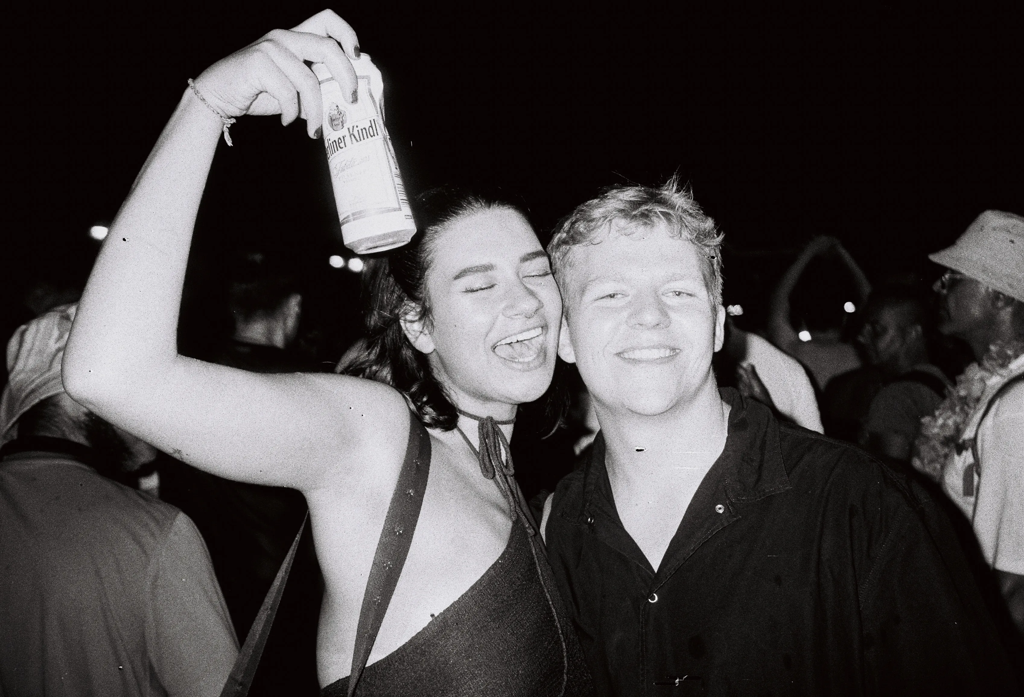
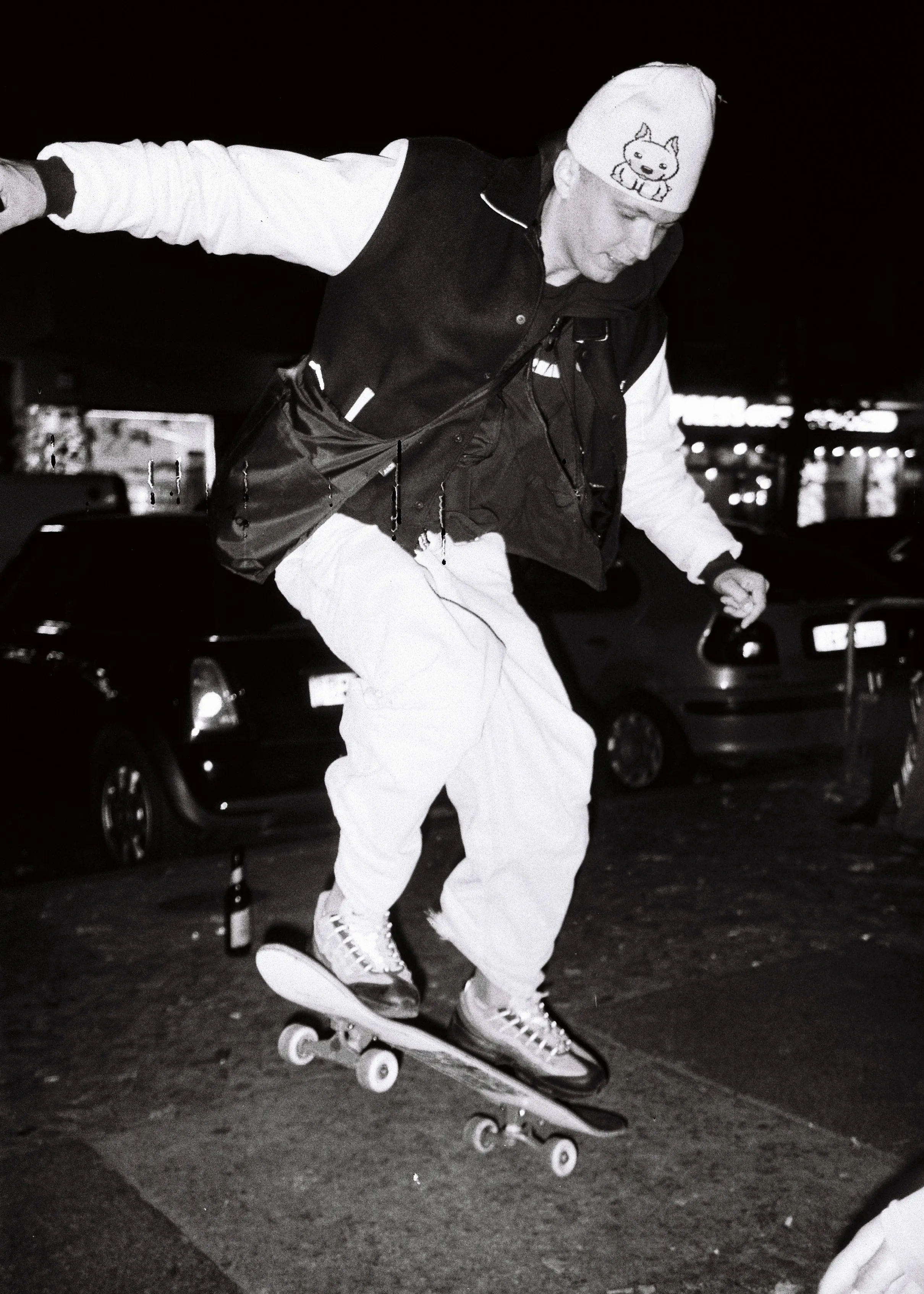
This marquee demonstrates Img in a continuous scrolling carousel. The first image has click-to-enlarge enabled, while others disable it for smooth scrolling interaction.




Carousel Test
This carousel showcases Img in a slideshow format with native aspect ratio preservation. Each slide has click-to-enlarge enabled.


How to Verify Features
Srcset Verification
- Open browser DevTools (F12)
- Go to Network tab
- Reload the page
- Filter for image requests
- Click any image to see which srcset variant was downloaded based on viewport size
- Astro auto-generates appropriate widths based on the
sizesattribute
Responsive Image Test
- Resize your browser window
- Each image should adapt to its specified width (400px, 800px, 50%, etc.)
- Network requests should change as viewport changes
- Images should load appropriate sizes for the viewport
Click-to-Enlarge Verification
- Click any image in the “Different Width Values” or “Carousel” sections
- A modal opens with the full-resolution WebP image
- Close via close button OR clicking the backdrop
- Press Escape key to close modal
- The modal is rendered by the ImageModal.astro component
Marquee Verification
- The marquee should auto-scroll smoothly
- Hover to pause the animation
- Click-to-enlarge is disabled in most carousel items for smooth scrolling
- First image has click-to-enlarge enabled
Technical Details
Img Component:
- Required props:
srcandalt(TypeScript enforced) - Width prop: Accepts CSS width values (“50%”, “800px”, etc.)
- Auto-derived sizes: Sizes attribute is calculated from width prop
- Responsive images: Astro Image component handles srcset generation automatically
- Modal: Full-resolution image via ImageModal component, close via button, backdrop click, or Escape key
ImageModal Component:
- Extracted modal component for click-to-enlarge functionality
- Uses Alpine.js for modal state management
- Displays full WebP image in responsive modal
Auto-derivation Examples:
width="50%"→sizes="50vw"width="800px"→sizes="800px"- Users can override sizes for advanced responsive scenarios
